Perfection is now cheap.
In 2026, anyone can conjure a flawless, studio-clean image in seconds. Which is why the most strategic brands are doing something counterintuitive. They are roughing up the edges. Designers are printing layouts, rubbing them on concrete, and scanning them back in to make the work feel lived in and therefore believable. In the vibe economy, a deliberate beauty mark can do more for trust than a thousand pixels of polish.
Why deliberate imperfection signals premium today
Consumers are not reacting to information, they are reacting to atmosphere. After years of hyper-optimized feeds, the eye has become fluent in what looks synthetic. Smooth gradients with no grit. Lighting that never breathes. Faces that are a little too symmetrical. Clean has started to read as calculated. The response, documented by Stocksy's 2026 Signs of Life report and reflected across leading design platforms, is a return to presence over performance. Imperfection has become a sign of authorship and therefore a proxy for truth.
This is not a rejection of technology. It is recalibration. At Studio Yellow, we integrate advanced AI for speed, planning, and insight, then choose moments where human touch must remain visible. The aim is not to appear messy. The aim is to look unmistakably made by people.
Ambient realism and analog imperfections, put to work
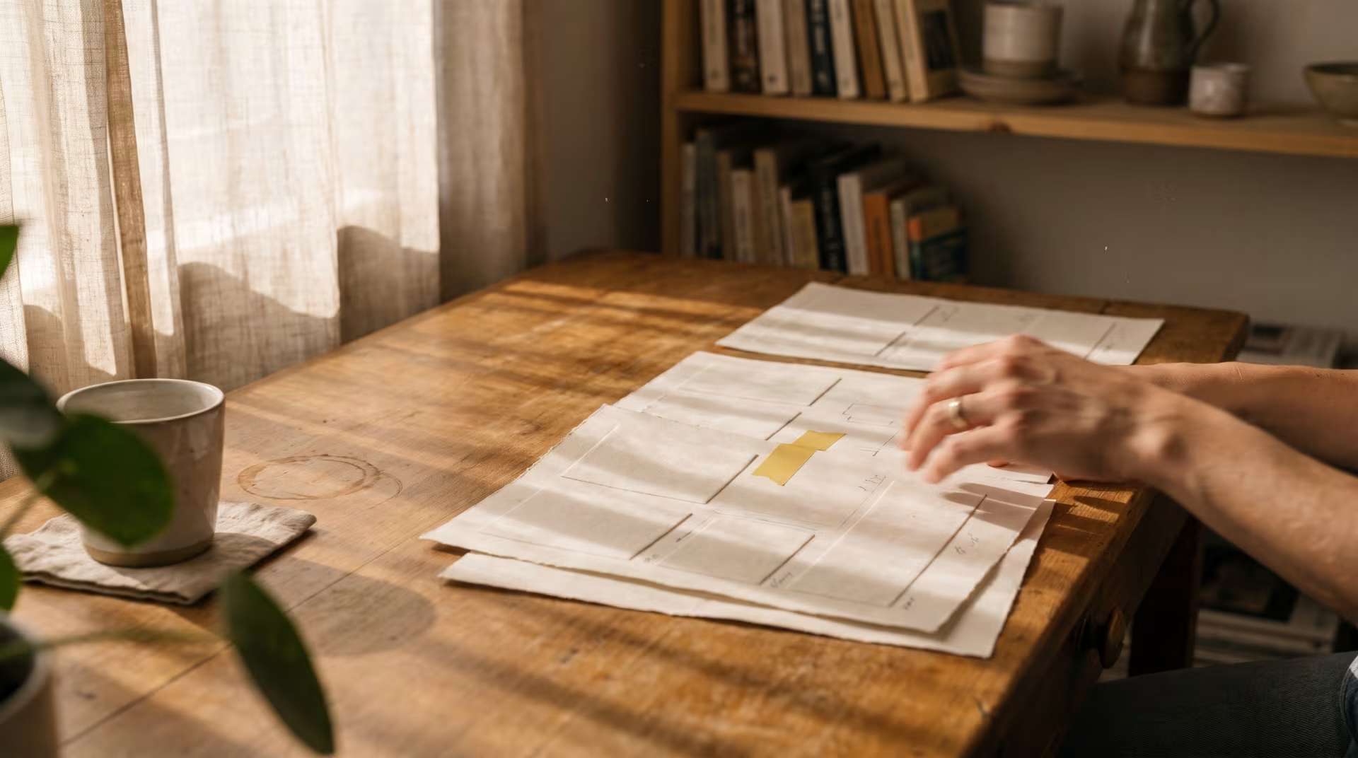
Ambient realism is the photography and motion language of quiet presence. It favors soft environments, natural light gradients, long shadows, and frames that feel like you are inside the room. Instead of immaculate sets, you get lived-in tables, half-drunk coffees, a pet asleep on the couch. The camera is often slightly off axis, with incidental blur and low-intensity intimacy that suggests a real moment observed, not staged.
Analog imperfections are the tactile cues that remind us of process. Grain. Scanner lines. Ink bleeds. Photocopier noise. Torn edges and tape shadows. Handwritten notes over otherwise neat typography. Used with intent, these signals tell the viewer there was time and touch behind the work.
Where this aesthetic strengthens brand value
Hospitality and boutique travel: Replace sterile, wide-angle hero shots with in-between scenes that sell restoration. Light cutting across linen. A hand opening a curtain. Condensation on glass. Movement that invites calm.
Food, beverage, and wellness: Embrace substrates with natural variation, wobbly type hierarchy where appropriate, and macro textures that feel edible or skin-close. Taste and tactility translate powerfully.
Culture and lifestyle: Social posts that lean on raw audio, imperfect crops, and photo-dump sequencing earn attention because they feel private rather than produced.
Packaging and retail: Recycled fibers, stamp ink bleeds, and hand-drawn glyphs command shelf presence because they interrupt the glossy sameness around them.
Where to proceed carefully or avoid
Cybersecurity, medical technology, financial systems, precision engineering: A wobbly line can read as a wobbly process. If you adopt imperfection, confine it to editorial storytelling, behind-the-scenes content, or secondary touchpoints. Keep product interfaces and critical communications crystalline and exact.
The art director's playbook for ambient realism
Use photography and motion direction that favors clarity of feeling over elaboration of set. The following principles keep the work premium, not messy.
1) Light with patience, not wattage
Natural gradients, long shadows, and time-of-day variation are your allies. Golden hour, overcast softness, and practical fixtures often beat huge rigs for authenticity.
Let darkness exist. Premium does not mean fully lit. It means intentional contrast where detail falls off gracefully.
2) Frame from inside the scene
Prefer shoulder-height or seated POV. Allow slight tilt, obstructions, and foreground elements. It reads like memory.
Accept micro-blur from real movement. A hand lifting a glass at a slightly slower shutter communicates more truth than a frozen tableau.
3) Cast for presence, not performance
Choose faces that carry story without trying. Micro-expressions, lived-in wardrobes, and light direction over heavy makeup produce credible intimacy.
4) Dress the set like life, edited
Surfaces with patina, books with cracked spines, fruit that is not uniform, paper stacks that are almost tidy. Keep clutter purposeful and color aware.
5) Color, grain, and texture as a system
Establish filmic color science and grain ranges as brand assets. Subtle chromatic aberration or halation can be cues, but define thresholds so they remain intentional.
Build a library of house textures captured by your team. Paper, canvas, fabric, concrete, brush marks. Own your tactility.
6) Hybrid production, the distress and scan workflow
Compose digitally for hierarchy, print on a common laser or inkjet, introduce physical wear with folding, rubbing, or light scoring, then scan back in.
Control variables. DPI, texture opacity, and edge softness should be documented, so the output reads designed, not damaged.
7) Motion that behaves like matter
Slow, elastic movement, fabric simulations, grainy frame-by-frame accents, and subtle parallax communicate touch. When everything on screen obeys tactile physics, the brain relaxes into it.
8) Sound, the hidden texture
For reels and films, favor room tone, footsteps, and environmental hum over stock beds. Audiences detect sincerity in sound before they name it.
9) Provenance you can stand behind
If authenticity is the promise, avoid AI from capture to final in the hero assets. Stock human-made sources, such as platforms that ban AI, support the claim. Use AI upstream for mood boards, shot lists, and planning where it improves efficiency without touching the final artifact.
10) Edit with negative space
Ambient realism breathes. Leave pauses, linger on transitions, and allow quiet shots that do not sell a feature. They sell a feeling that earns trust.
Applications across key touchpoints
Websites and product pages: Replace sterile hero carousels with subtle parallax scenes where background textures shift at low velocity, and CTA blocks sit on scanned paper or fabric at 10 to 30 percent opacity. Keep interaction precise while the environment feels tactile.
Long-form content and case studies: Mix crisp data visualizations with margin notes in a human hand and occasional page artifacts. Readers sense both rigor and craft.
Brand films and social: Trade storyboards that shout for sequences that observe. One continuous shot moving from shadowed hallway to sunlit table can say more about quality than a montage.
Retail and packaging: Specify natural substrate variation as a feature, not a defect. Accept controlled registration drift and ink bleed within a tight tolerance window.
Avoiding the fauxbi-sabi trap
A growing library of texture overlays and automated filters promises instant authenticity. It rarely delivers. When the market spots the same off-the-shelf scratches across brands, the tactic collapses. The remedy is provenance and constraint.
Make your own textures and capture your own scenes. Even a half day spent scanning paper, photographing walls, or inking marks will give you assets no one else has.
Document the system. Define grain strength, vignette radius, texture opacity, and motion speed ranges. Consistency proves intent.
Keep legibility sacred. Imperfection should never reduce clarity in critical information. If in doubt, remove the texture and rely on composition.
Scaling the human touch without losing it
Premium brands need volume. The answer is not shortcuts, it is standards.
Componentize the analog. Create a shared kit of brand textures, hand lettering sets, and motion behaviors, each with clear usage rules. Treat them like code libraries for designers.
Build production calendars that respect capture windows. If the look depends on sun angles and long shadows, schedule for it. Speed only matters if the outcome is still believable.
Train cross-functional teams. Photographers should understand typography and designers should understand light, so the analog and digital layers meet cleanly.
How to measure what this aesthetic is really doing
This is not purely aesthetic preference, it is performance strategy. Track both brand and behavior.
Brand signals: unaided recall in qualitative interviews, perceived authenticity and premium association in brand lift studies, press and influencer mentions that reference the look and feel.
Behavioral signals: dwell time on visually rich pages, video completion rates when sound and motion are tactile, saves and shares on social where ambient narratives replace hard sells, conversion shifts on packaging A tests when substrates and grain change.
Efficiency signals: content half-life on social when sequences feel human, not ad-like. Ambient realism often earns more replays and comments over time because it reads as personal.
AI is in the loop, it is not the look
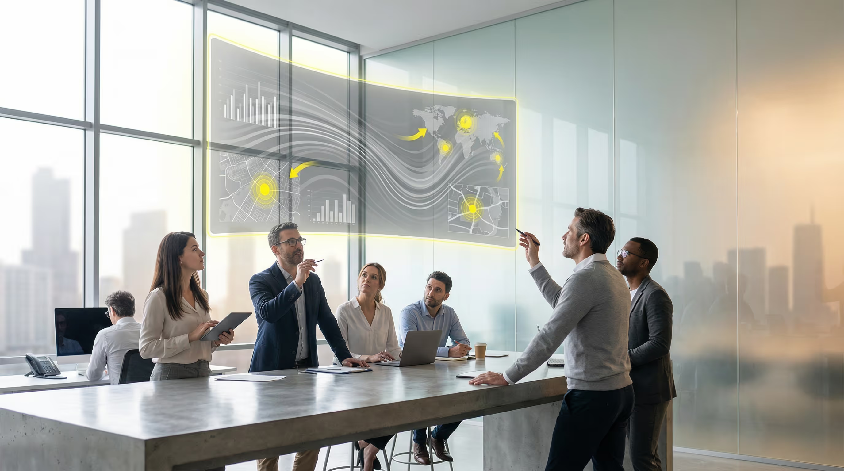
Generative tools are excellent for planning. We use AI for mood exploration, shot list generation, scene composition ideation, and performance analysis. We also use it to accelerate asset management and QA. Then we deliberately pivot to human capture for the final artifact when the goal is trust. This is how technology serves credibility rather than undermines it.
The strategic posture behind the aesthetic
Premium is not louder, it is slower and more exacting. It respects attention by offering sensory confidence. Ambient realism and analog imperfections are not trends to mimic, they are permissions to show evidence of care. They exchange showmanship for stewardship of feeling.
This is the deeper point. In a market saturated with perfect pictures, what reads as luxury is proof that someone stayed in the room long enough to notice the way light falls on a wall. That is the beauty mark that makes a brand unforgettable. At Studio Yellow, we treat that mark like a system, guided by data and delivered with craft, so the result is not just different, it is inevitable.